WEBSITE REDESIGN
Costco Checkout Process
Costco Wholesale is a membership warehouse club famous for providing great deals and exceptional customer service globally. As a learning opportunity, I redesigned Costco.com’s checkout process to be faster and more efficient.
Disclaimer: This project is not affiliated with Costco Wholesale in any way.
CONTRIBUTIONS
Heuristic Evaluations
Usability Testing
Competitive Analysis
User Flows
Sketching
Design Mockups
ROLE
Product Designer
UX Researcher
DURATION
2 weeks
1/4
Research
HEURISTIC EVALUATIONS
Reviewing and critiquing the existing designs
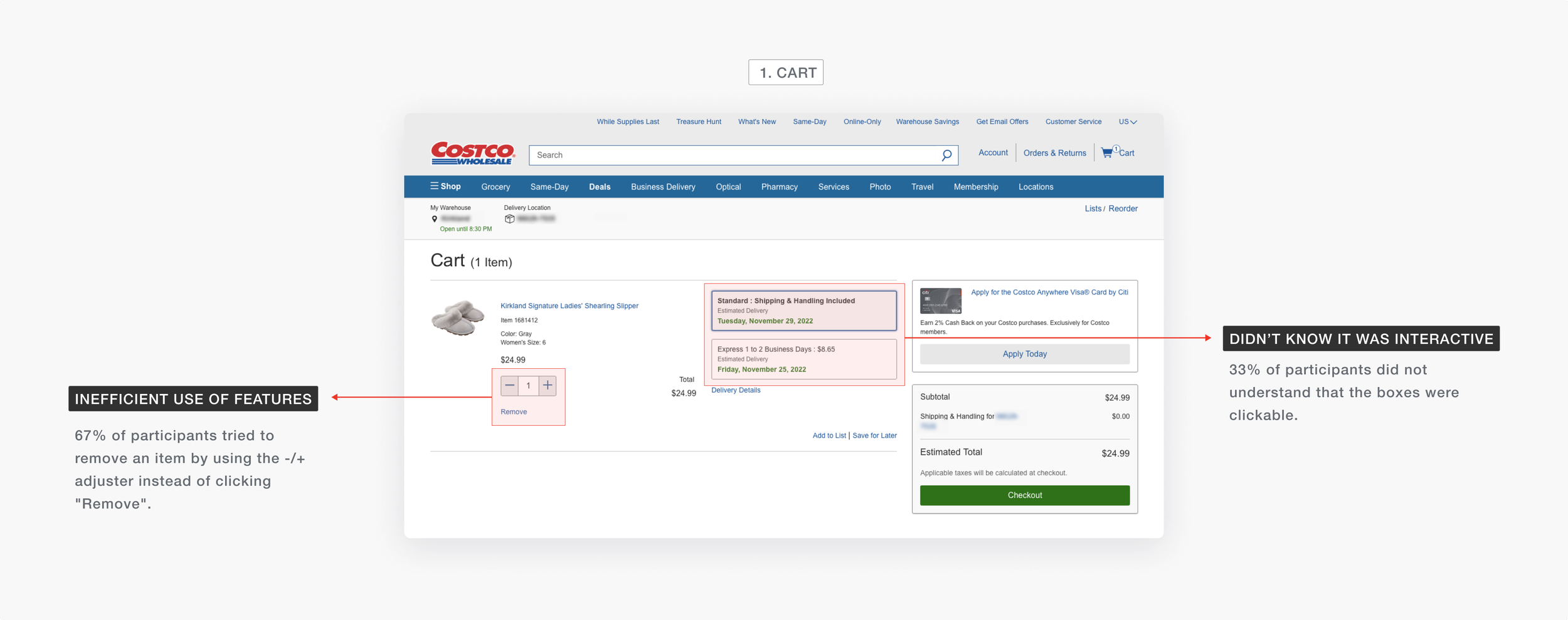
For the first step, I conducted a heuristic evaluation of the checkout process to understand usability issues. I compiled a report detailing the severity of the usability issues encountered on two major pages of the process: My Cart and Checkout.
CONCLUSION OF INITIAL REVIEW
Costco’s checkout process violated 7 out of 10 heuristics.
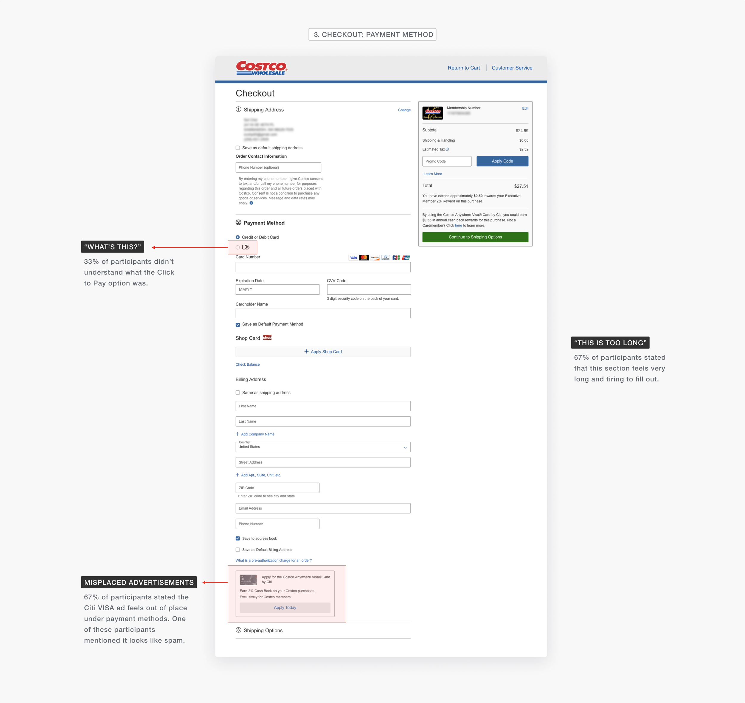
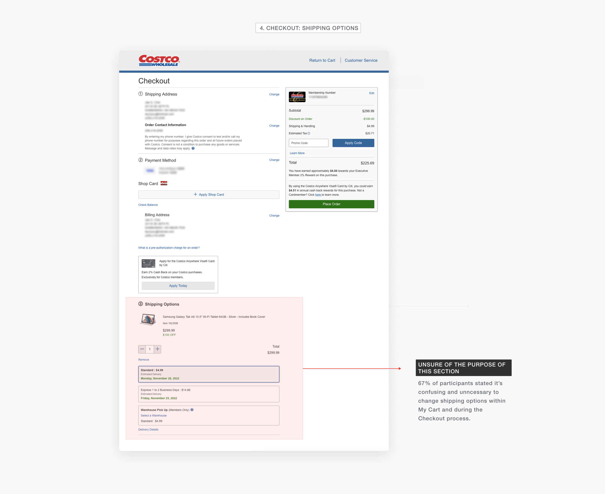
There were several violations that affected the usability. Most were minor usability issues, but some seemed to pose larger frustrations due to confusing and unclear affordances. Below are the key highlights of the heuristic evaluation.
USABILITY TESTING
Validating the assumptions through testing
After conducting heuristic evaluations, I wanted to validate the findings with real users by recruiting 3 Costco members to participate in a usability testing.
Each participant completed four tasks on the existing Cart and Checkout page while I probed to understand the reasoning and thought process behind the decisions they made.
Clutter causes major delays 📉
Distractions on the page made it difficult for users to proceed to the next step. The overload of information on the page prevented 2 out of 3 users to get to the next section in the checkout process.
Uncertainty over features 🤨
Certain features on the page were met with question and uncertainty over how it works or what it does.
2/4
Restructuring the flow & design
INFORMATION ARCHITECTURE
Brainstorming a flow with less redundancy and clutter
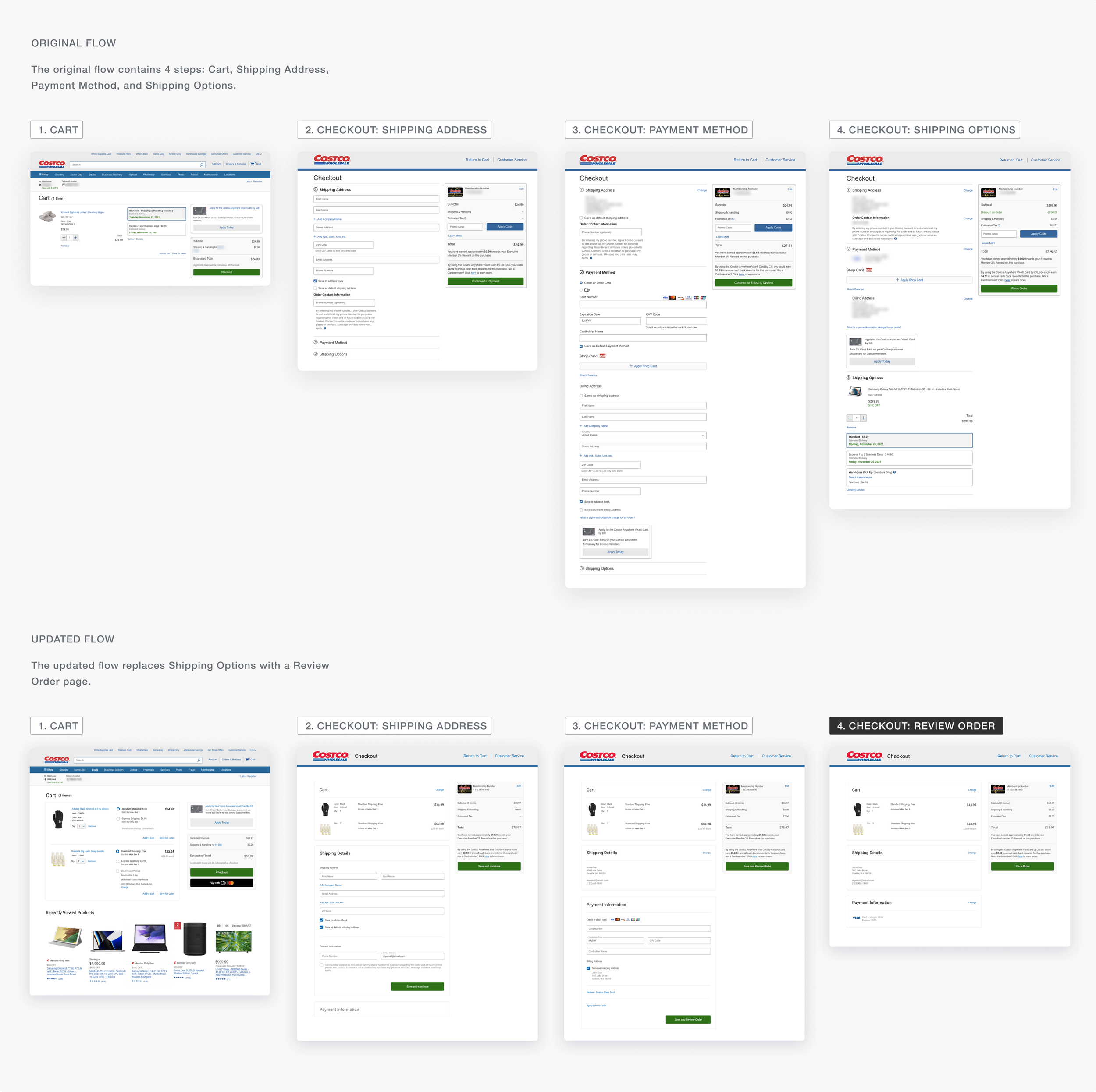
After understanding where the design failed, I remapped the user flow of the checkout process. Because there were checkpoints in the checkout process which were redundant to the user, I simplified the flow to reduce the overall time it takes to place an order.
FIRST ITERATION
Designing the new flow
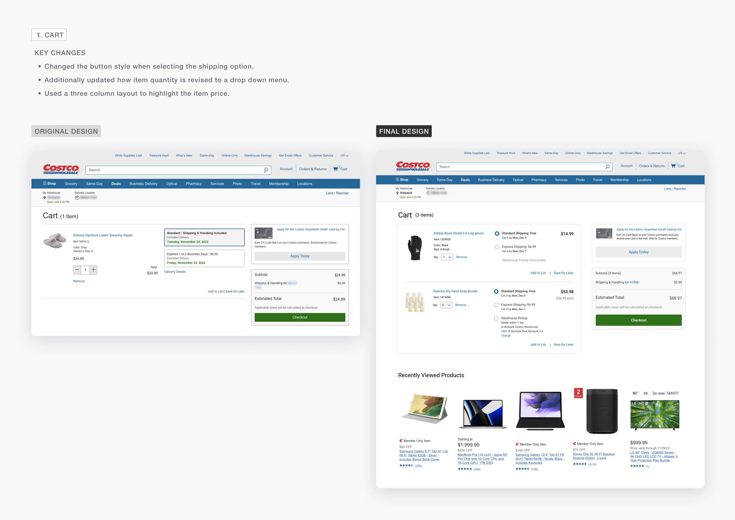
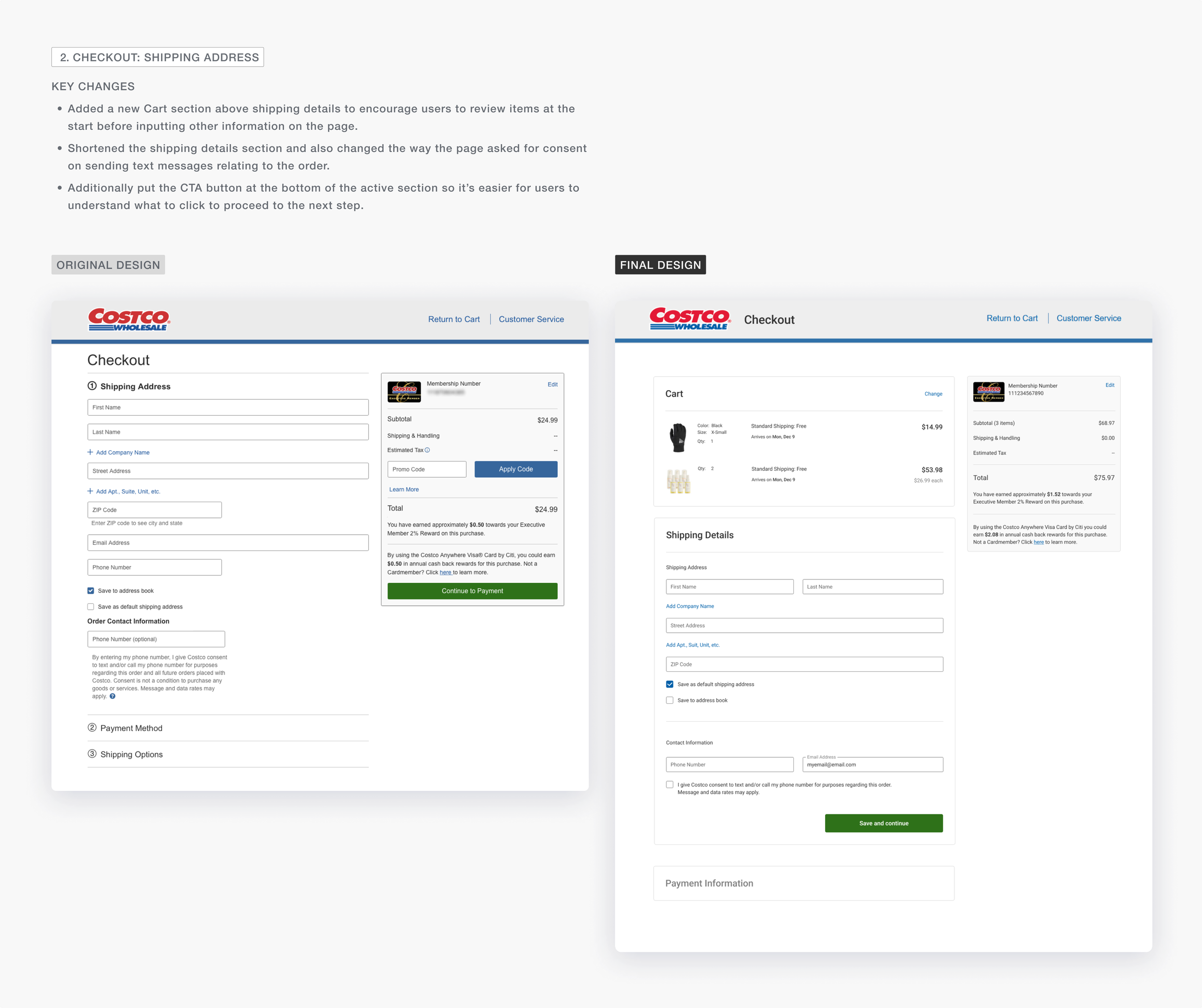
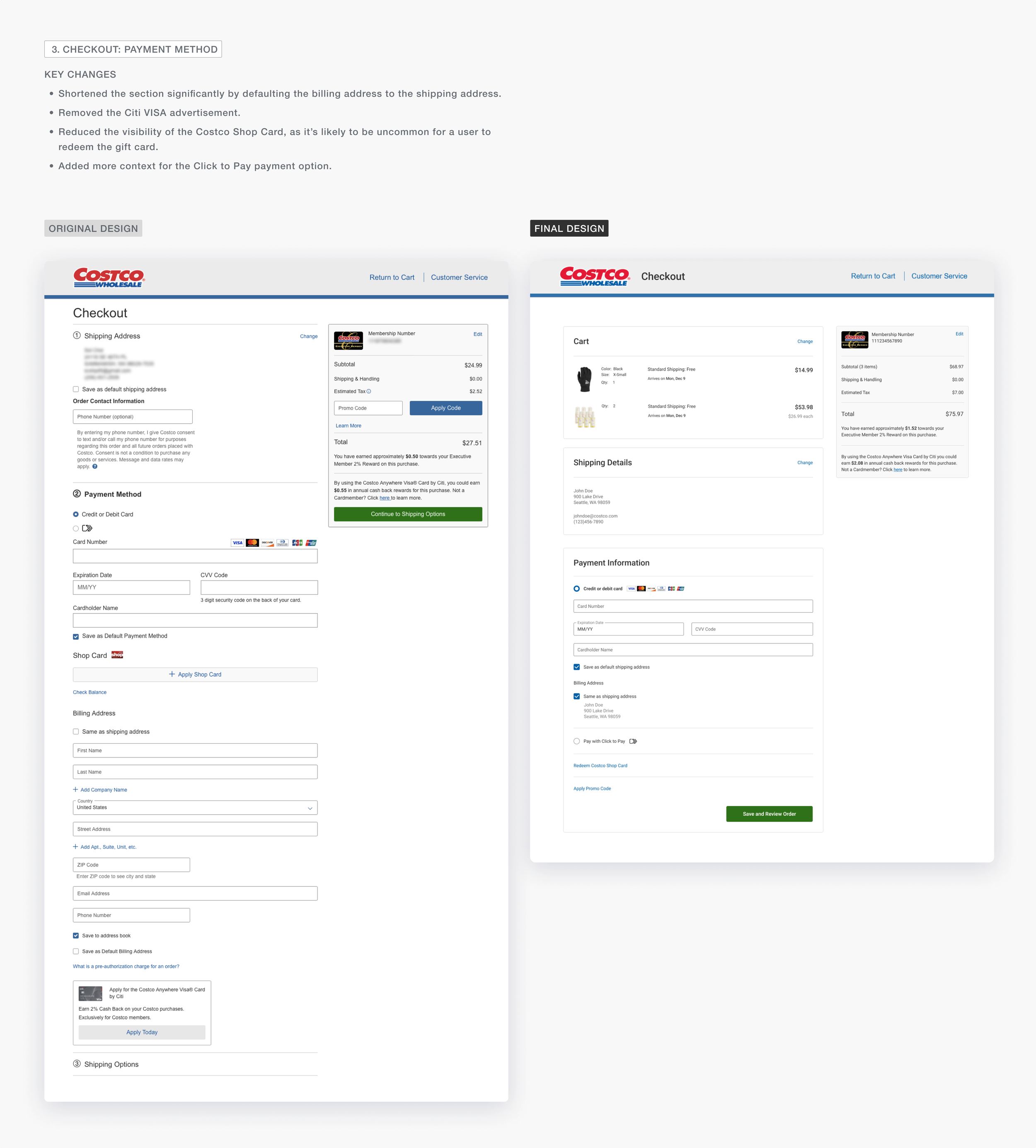
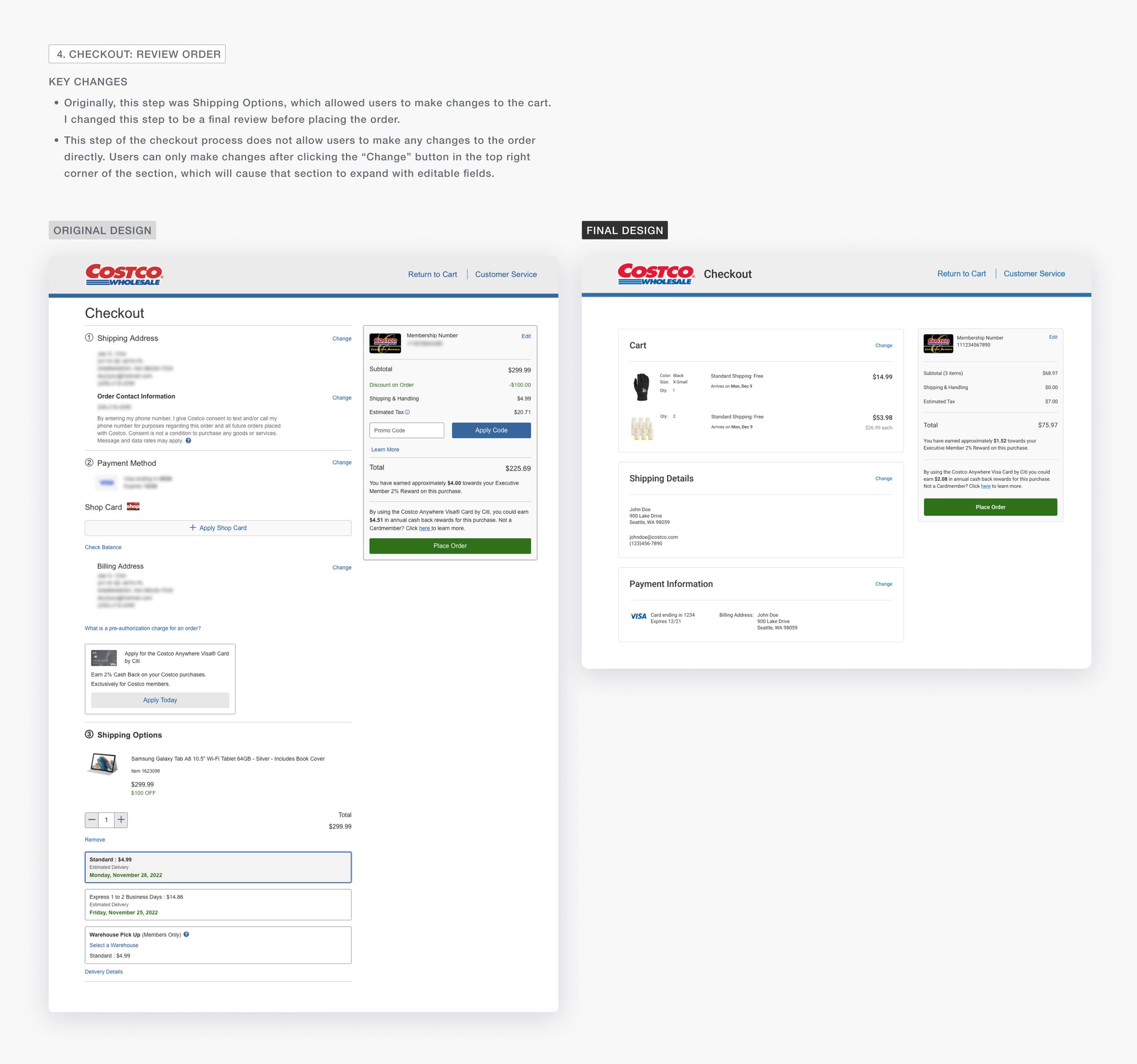
Using what was learned in the research process, I redesigned the Cart, Shipping Address, and Payment Method page, and created a net new Review Order page to test for the next phase of the project.
3/4
Evaluation
SECOND USABILITY TESTING
The key improvements were received positively, but there were still other minor issues.
After the first round of designs, I tested the designs with other Costco members to understand how the changes impacted the user experience of checking out.
What was validated? ✅
-
Previously on the original design, 3 out of 3 users struggled to get to the next section in the checkout page. However, by moving the CTA out of the moving panel and into each individual section, 2 out of 2 users from the second usability test had zero issue completing each step.
-
Removing the Citi VISA advertisement and shortening the overall payment section allowed all users to quickly input the required information to get to the next step without distractions.
-
By replacing the Shipping Options section with the new Cart section, users now only needed to simply review the summarized cart information.
Previously in shipping options section, the design appeared to look like users needed to decide again on the shipping options, rather than simply review it.
By displaying a summary of the shipping options rather than allowing users to reselect the shipping option, both users quickly proceeded to the next step in less than 3 seconds.
What issues remained? ❌
-
In the new design, I moved the Click to Pay option in the Cart section. The user could choose to check out normally, or with Click to Pay at this step in the process. However, both users didn’t understand the difference between the “Checkout” and “click to pay” button.
-
Users tend not to read long text and simply clicked the checkbox thinking it was required to continue to payment.
-
Users did not click on the CTA button in the summary panel on the right and felt that it was unnecessary to add two of the same buttons on the page.
4/4
Final Designs
From the new round of testing, I was able to discover additional changes I needed to make to address the key usability issues on Costco.com.
The biggest finding was that users need more clarity and context.
These two points became the main concern of change in the second redesign.
Below is a summary of the design changes from the original design. The pages that have been updated are the Cart and the individual sections (Shipping Address, Payment Method, Shipping Options) in the Checkout page.
Reflection
This side project was a valuable learning experience. From conducting both the heuristic evaluations and usability tests, I learned how important it is to conduct usability tests even after an expert review, as it can turn over our subconscious biases and opinions and help us discover unique patterns and findings regarding the usability of a product.
Next Steps
-
Ideally, it would be best to have been able to conduct multiple tests to have more confidence in the validation of the designs. This could also uncover additional usability issues that were not discovered from the heuristic evaluations and the usability tests.
-
For this project, I only accounted for the desktop version of the checkout process. As a part of the next step, I would focus on making improvements on the mobile designs. Although certain findings from the desktop experience may carry over, it’s still important to conduct additional research to understand usability issues specific to the mobile experience.
-
If this was an actual design that was launched online, I would study the analytics and metrics to understand how the revisions in the design affected the funnel. Depending on the analytics, I would continue to work on improving the metrics and conversion rate of the checkout process.
What would I have done differently?
-
In a real world setting, I would have wanted to do a feedback session with product managers and engineers regarding engineering limitations.
-
I would want to understand why the checkout process was designed the way it was. Understanding the context as to why certain design decisions were made in the past would be another factor in determining how I would have designed the new checkout process.


