INTERNAL TOOLS REDESIGN
Carina Admin Tools
Context
Carina is a care-matching service that has connected caregivers to clients to deliver over 1 million hours of home care since 2017. While Carina continued to quickly expand its services across the nation, we underwent a full-stack migration from carinacare.com to carina.org. During this process, I led the efforts in overhauling the fragmented Admin Tools Dashboard.
Team: 2 product designers, 3 engineers, 1 product manager
Contributions: User interviews, site-mapping, user flows, design mockups, developer hand-off
Duration: 3 months
Solution & Results
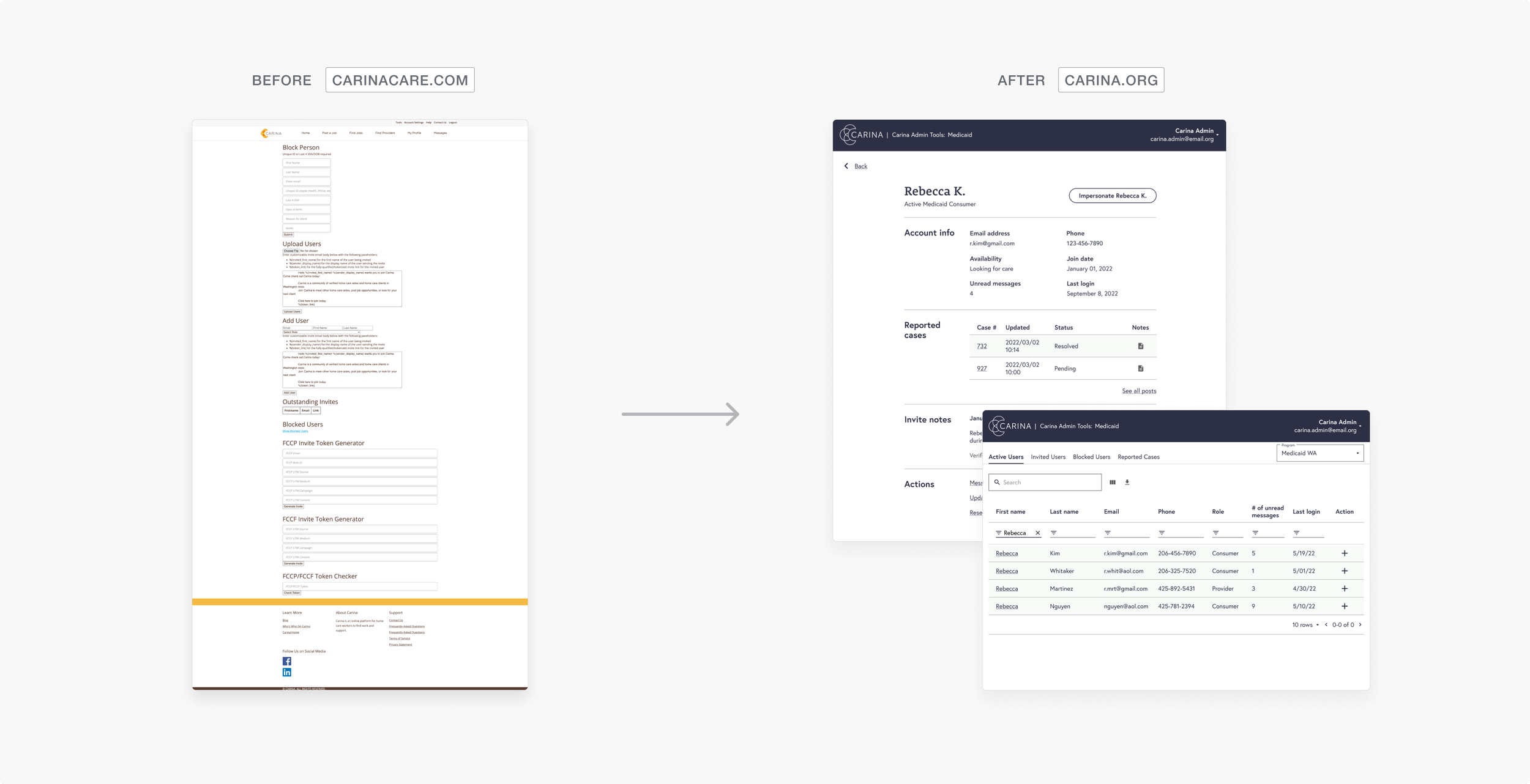
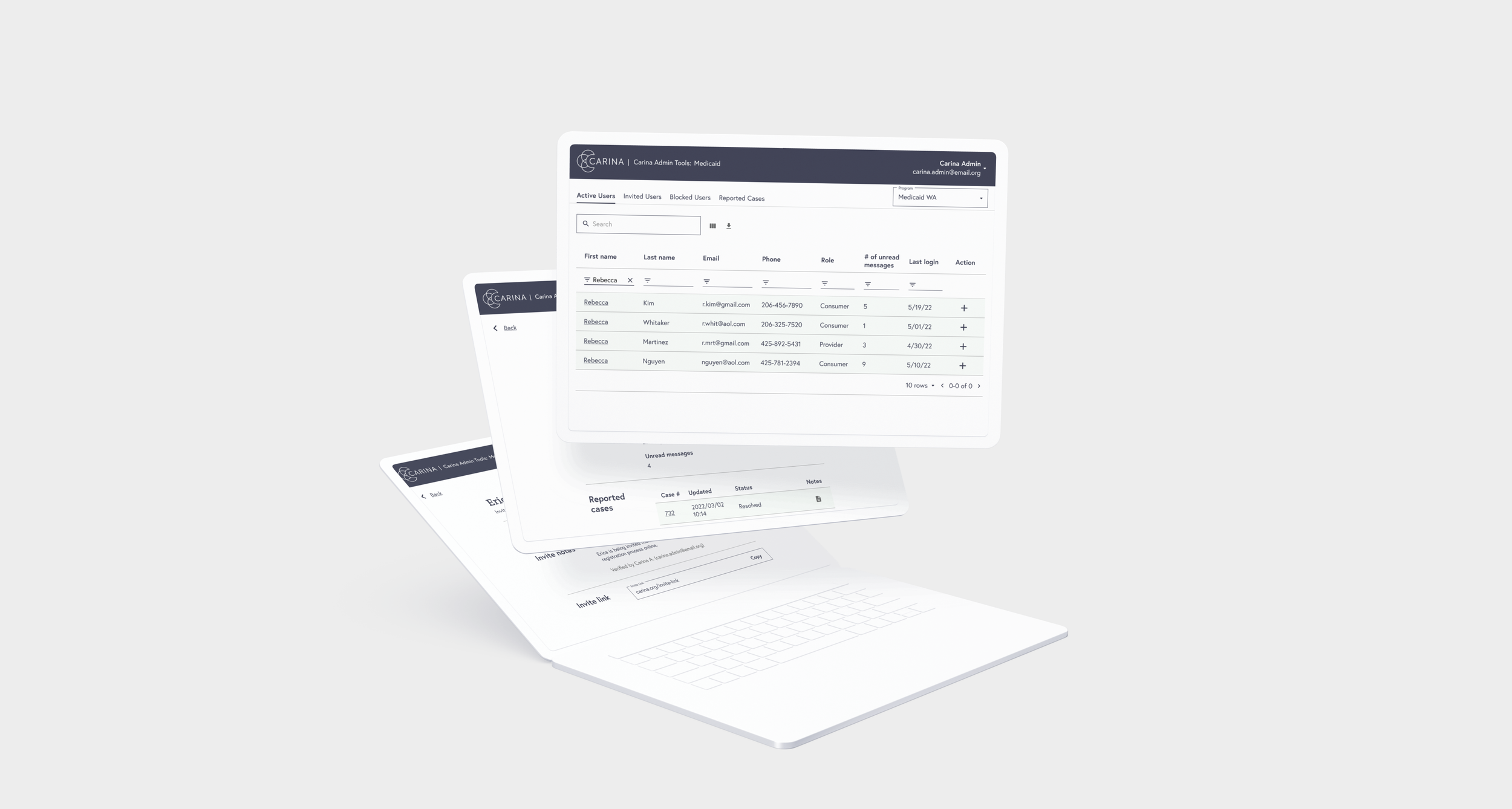
In a 3 month effort, our team created a clean and scannable dashboard built for scalability, allowing admins to easily find user profiles and update case reports.
The New York State of Health renewed their contract with updates to the new Admin Tools, allowing us to maintain our partnerships with 20+ home care agencies across 5 counties in New York State.
Through follow-up interviews, we found 91% of users from testing noted improved usability and that the new system enhanced their workflow significantly.
1/6
Research Process
Our team analyzed the existing design to discover severe usability issues and interviewed end users to understand pain points and goals.
USER INTERVIEWS
Understanding why and how current admins use the admin tools
We interviewed 2 internal staff on the user support team. From these interviews, we wanted to understand our user support team’s work flow and daily tasks to determine key features.
ANALYZING THE DESIGN
Getting familiar with an unfamiliar design
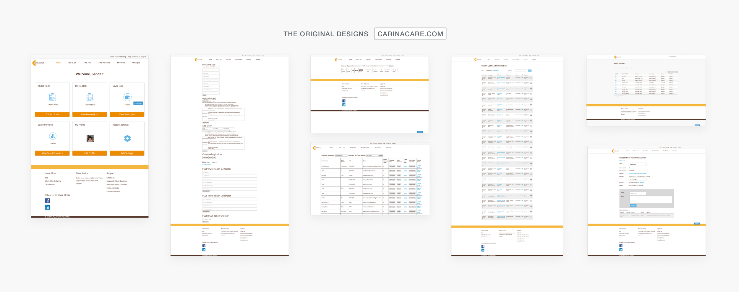
First, we created a sitemap to understand what pages existed and how they were interconnected. As shown below, the old design was clunky and outdated, and the unintuitive navigation system made it difficult for users to find what they needed.
From research, we discovered 2 main problems affecting the current usability.
PROBLEM #1
The structure was extremely fragmented and disjointed.
Carina offers three types of programs: Medicaid, Private Pay, and Child Care. This meant there were specific Administrative Dashboards for each. However, this entire experience was extremely disjointed.
To access all administrative features, admins needed 3 separate login credentials. These logins were spread across two websites: Carina.org and Carinacare.com.
PROBLEM #2
Majority of features were jammed into one page.
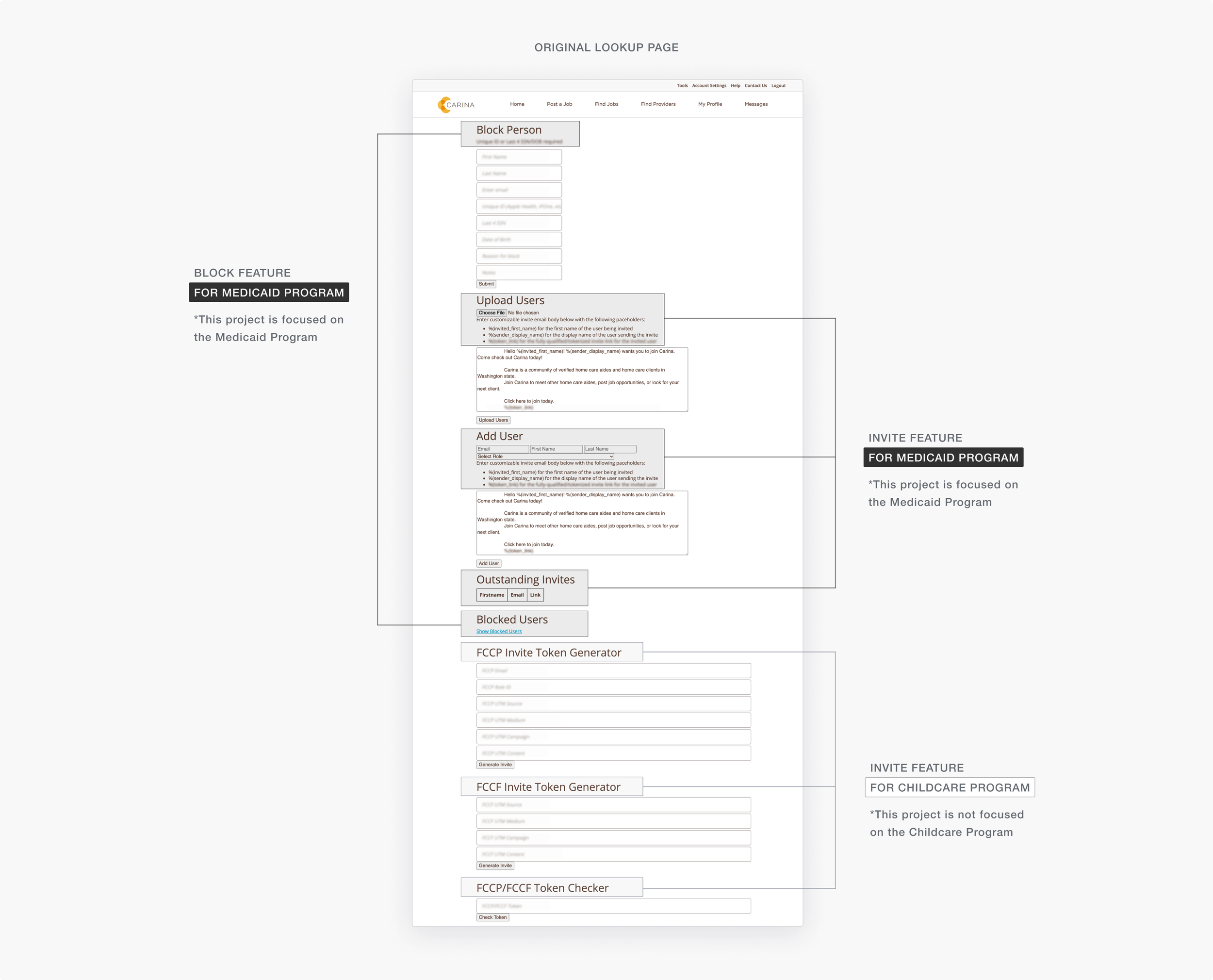
The old Admin Tools had one specific page with 4 main functionalities fully laid out. This made the page extremely cluttered and frankly, an eye-sore.
The 3 big issues:
Too much functionality on one page, making it more complicated than it should be.
Difficult to read or follow.
Visually unappealing.
2/6
Feature prioritization
Narrowing down key features
Based on our research, we found that there were several features and tools in the existing Medicaid Admin Tools. However, because we were on a tight engineering schedule, we needed to narrow down the list of features to only include what was essential for user support admins do to their daily tasks.
Resolve Reports 🗃️
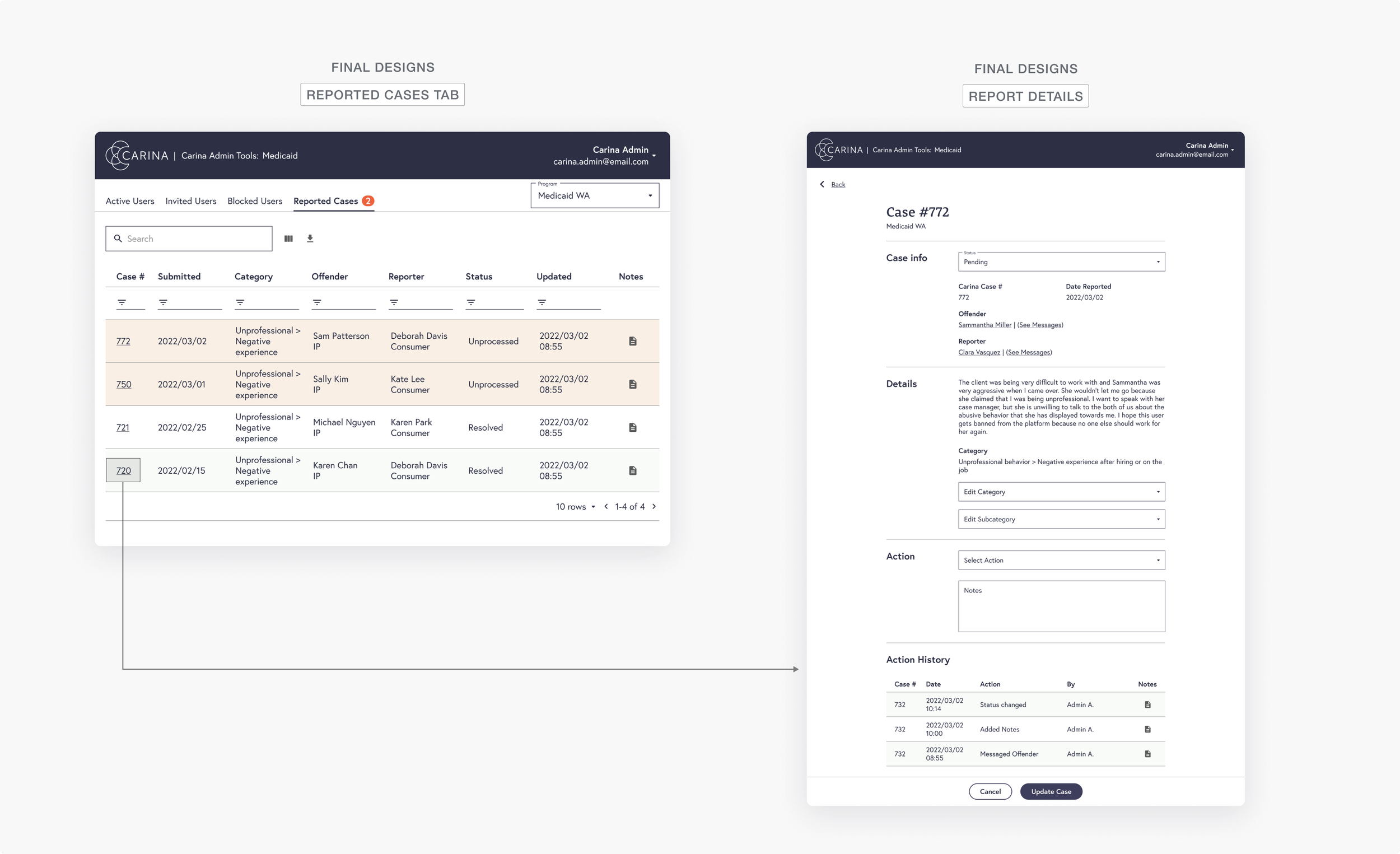
Attend to and take account of user complaints and track changes to report cases.
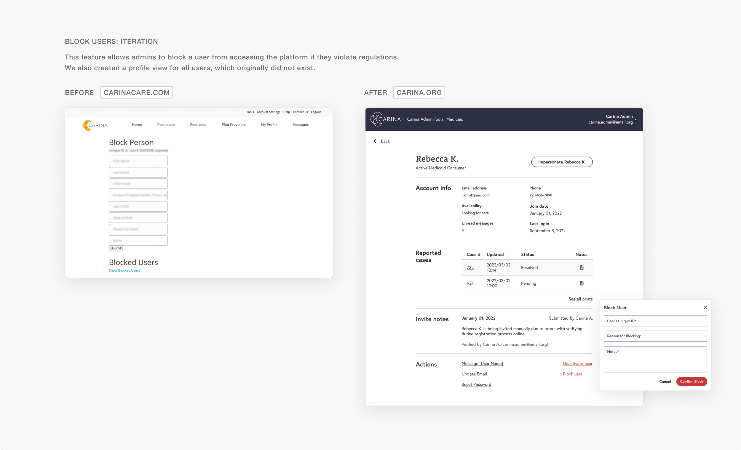
Block Users ❌
Prevent certain users from accessing the platform.
Troubleshoot ⚙️
Help users with account set up and support such as email and password resets.
Invite Users 📮
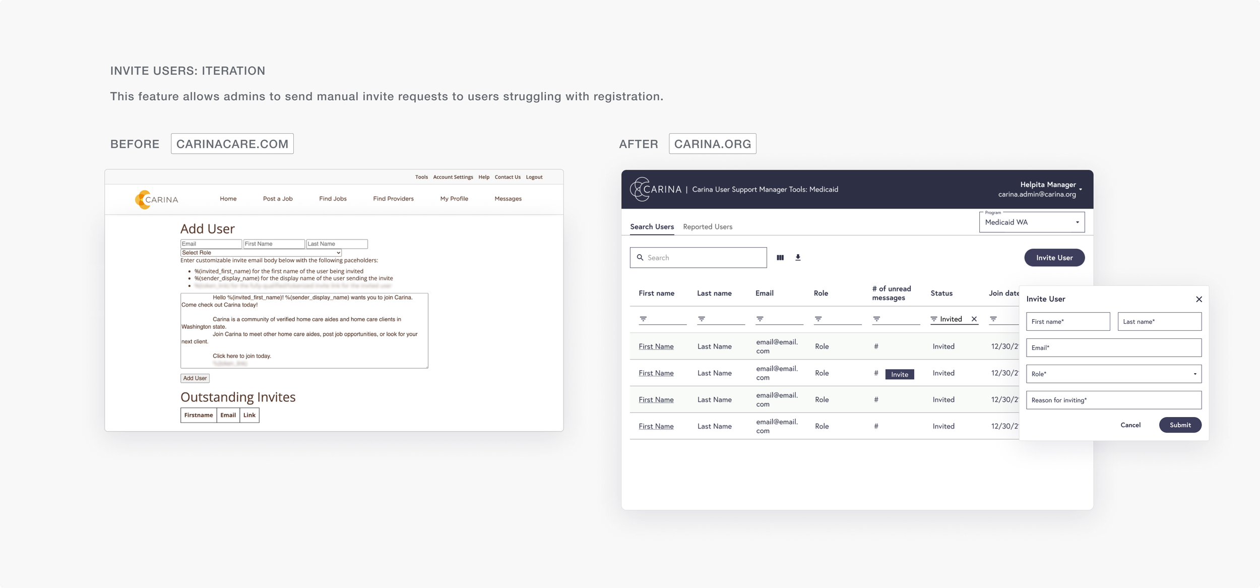
Send out manual invitations to users who are running into errors when attempting to sign up for an account.
Crucial factors to consider for the re-design
From the research phase, we discovered the existing admin experience was quite disjointed. This made it inefficient for admins that needed to regularly switch between different Admin Tools. It would be ideal for admins to be able to access all administrative features through one login.
After gathering information on design requirements and engineering limitations, we organized our findings to define structural requirements for the new Admin Experience.
Modular 🧩
Features are interchangeable based on admin type, allowing every admins to have different administrative capabilities.
Scalable 📈
Build a dashboard with a flexible structure in the navigation to account for growth and new features in the future.
One Login 🔐
Allow convenience of having one account to reduce friction of having to remember numerous account credentials.
3/6
Restructuring the entire system
INFORMATION ARCHITECTURE
Mapping a new system that supports scalability + modularity under one login.
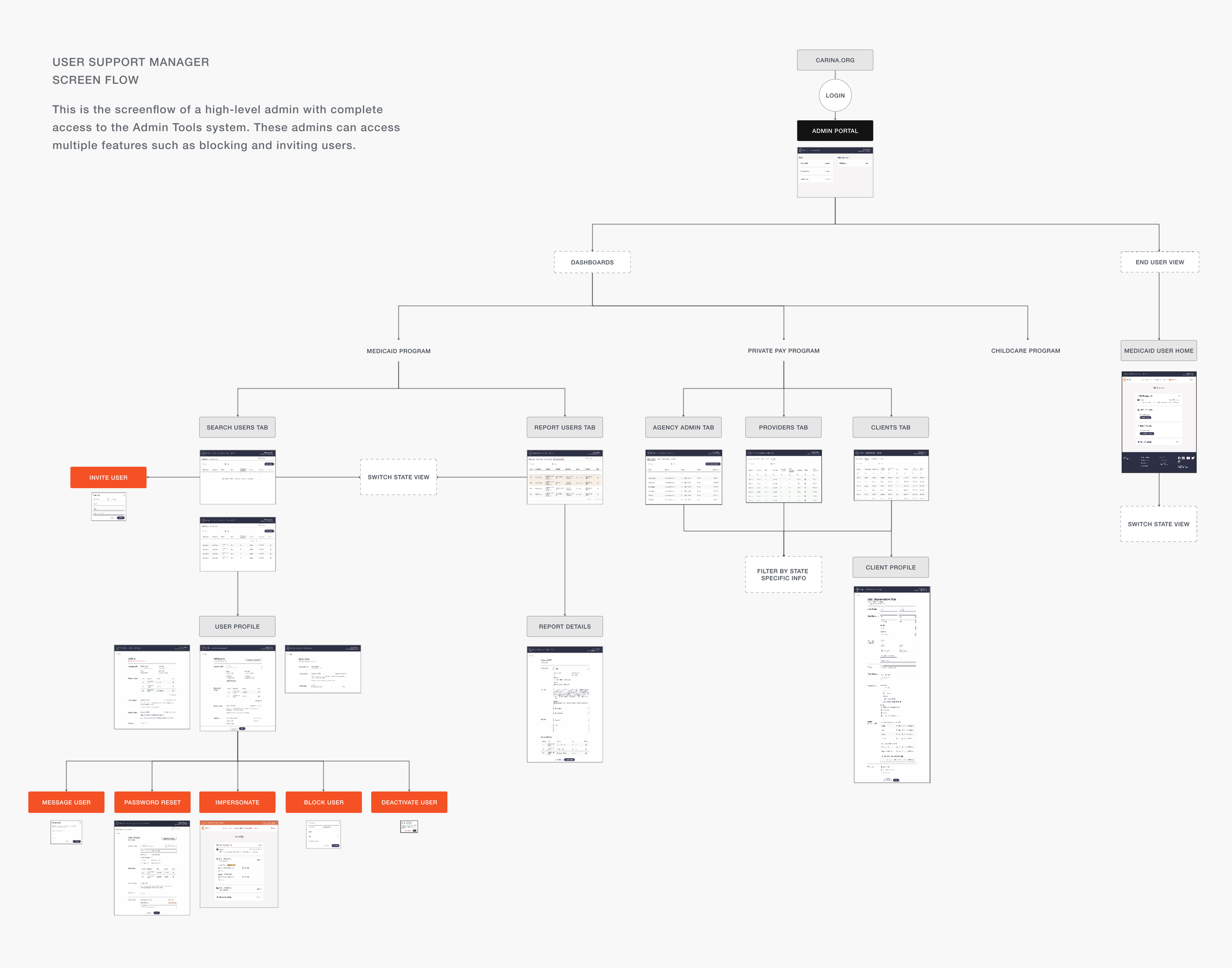
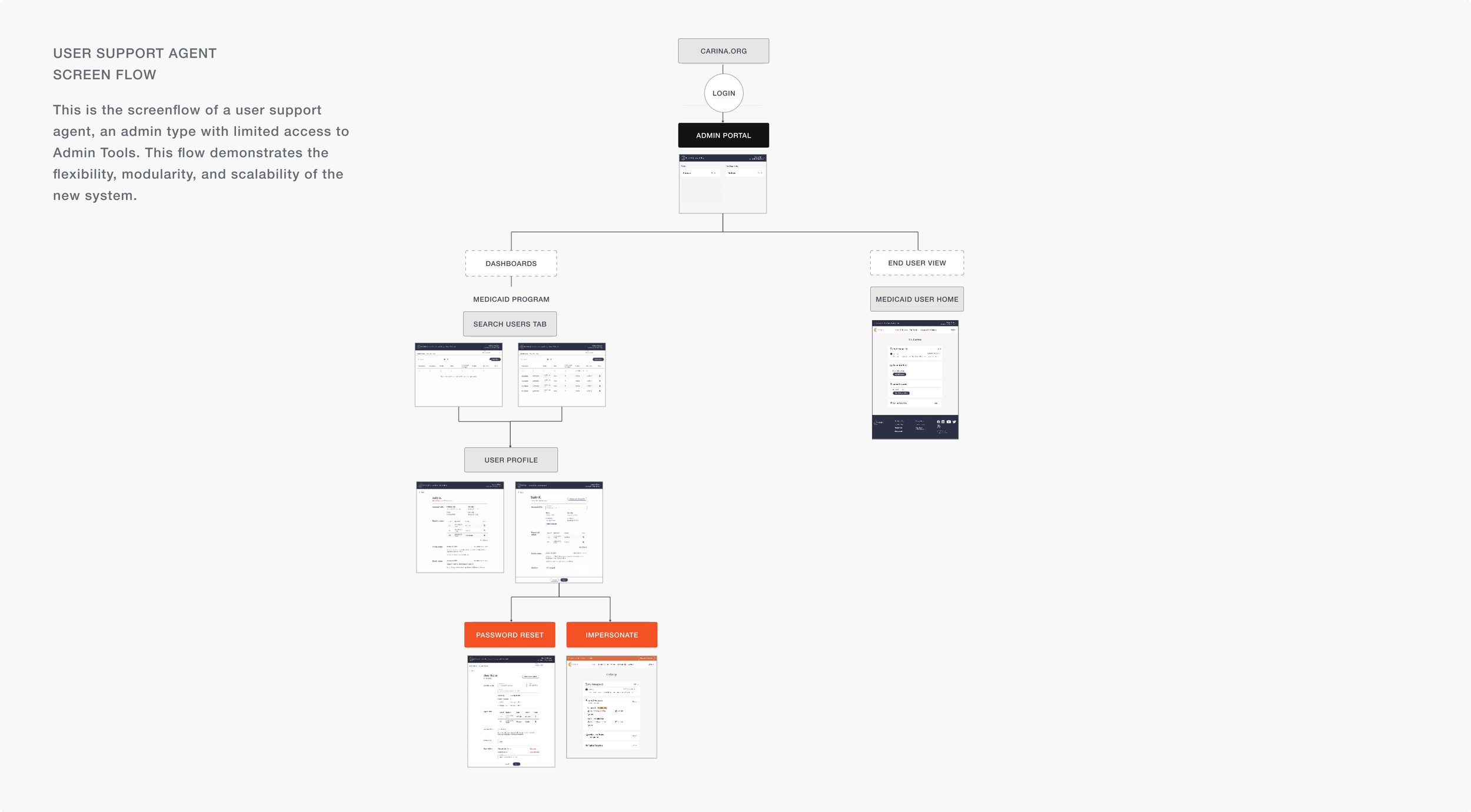
For the new navigation system, admins need to access all features through one login. To map out the experience, we created a sitemap to visualize the new Admin Tools navigation. We created two sitemaps to demonstrate the modularity of the new system. One sitemap represents the full access to Admin Tools. The other shows the new navigation can be modular by limiting access to Admin Tools.
4/6
Redesigning the main features of the admin tools
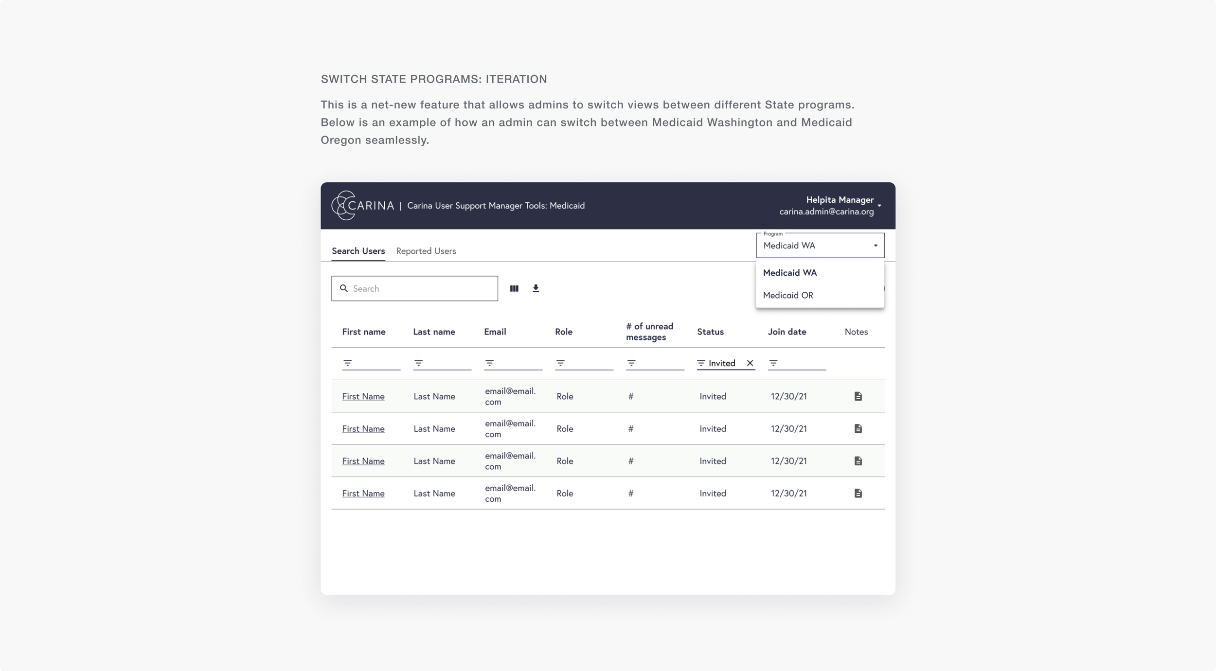
For the new design, we added features in a sensibly dedicated place on the page, making it easy for admins to find and use the features. We also added a feature to switch between State Programs, which was not possible on the old system.
5/6
Feedback Session
After creating the designs, we made a user flow to present to the product team for critique and feedback. This was an effective way to show the navigational structure in a digestible format.
Below are the two user flows we demonstrated during our design review.
DESIGN REVIEW
What did the rest of the product team think?
During design review, engineers and product management asked questions about the new navigation and provided feedback on the proposal.
Navigational structure and most of the design was approved.
But here’s what we needed to revise:
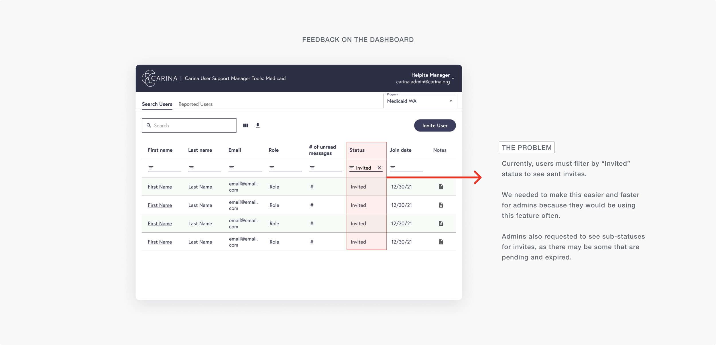
More visibility
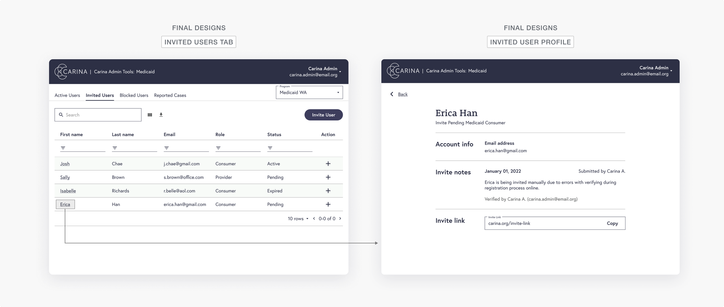
Because user support and management often audit the list of invited users, we needed to increase the list’s visibility to encourage frequent auditing and consider a variety of sub statuses.
Multiple Statuses
Need to account for pending and expired statuses for auditing purposes.
6/6
The Final Designs
Below are the final changes. We incorporated a tabbed design to allow for the most navigational flexibility needed by admins.
Additionally, using a tab design clearly distinguished the different types of users on our platform. This made it easier to incorporate sub-statuses specific to the type of user.
Reflection
This project was a great learning experience in migrating a website from one stack to another. As we were on a time crunch to move everything over, we needed to provide designs that could be quickly executed and built by the engineering team. This meant that we needed to update the design while fixing existing usability problems, but also ensure that the designs would result in minimal changes to how the back-end code was written. This project was a great challenge for me regarding engineering constraints.
Next Steps
-
Because the Admin Tools was built quickly to meet the needs of our user support team, I would want to conduct some user interviews with internal staff to understand where the new Admin Tools is lacking. It would be beneficial to see how user support fulfills certain day-to-day tasks, such as resolving a complaint case or helping users with account changes.
-
Carina has three main care programs: Private pay, Medicaid, and Child Care. The last program which is in need of Admin Tools is the Child Care program. I would focus on scheduling meetings with managers heavily involved in the child care program to understand what features would need to be built out for Child Care Admin Tools.

